How to read our reports
Each year, the NHS Benchmarking Network publish summary and bespoke reports for our members. These reports follow a similar format. This page provides examples of how we display the findings to support users in interpreting the results.
Benchmarking bar chart
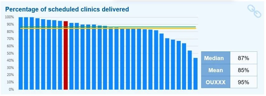
We use this type of bar chart as our standard approach to displaying numerical comparisons. The data is sorted from highest on the left to lowest on the right. The bars for the group are shown in blue, while the organisation/submission’s value will be highlighted in a different colour (usually red for projects where organisations normally have a single submission). For reports that include regional peer grouping, bars in the region local to the organisation will be highlighted in green. Average values such as the mean and median are is displayed as a horizontal lines. A supporting table providing numerical values for the submission(s) and summary statistics is normally situated next to the chart.
Please note with this, and the following examples that the icon in the top right corner provides a hyperlink to the chart in the project’s online toolkit on our members’ area, which will enable you to examine the chart in further details (e.g. peer groups or accessing all the bars values).
In the example shown the chart compares the percentage of scheduled outpatients clinics which were delivered. The values range from just over 40% to 100%, and the selected organisation has a value of 95%. A green median line is shown at 87%, and a yellow mean line is shown at 85%
Yes/No chart
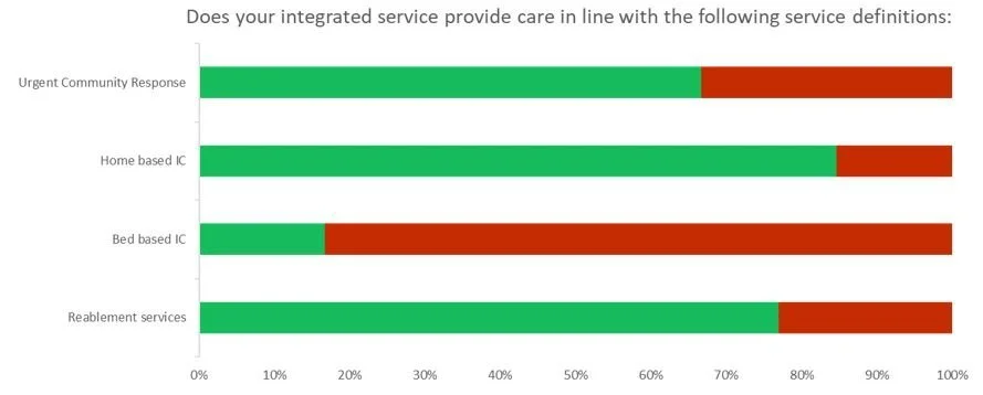
Responses to Yes/No questions are often displayed as grouped bar charts where the proportion of yes responses is show in one colour (often green) and no responses another (often red). This enables us to compare the responses from related questions. We often display single yes/no questions as pie charts. These charts are usually accompanied by a table giving the values in numbers, and displaying the responses by the selected organisation.
In the example shown the chart examines which types of care are provided by integrated intermediate care services. The chart shows that these integrated services primarily services provided at the patients home, with ‘Bed based Intermediate Care’ only included rarely.
Pie chart
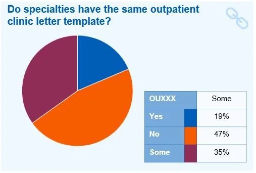
We normally use pie charts to compare the responses to list questions from our surveys.
The respective size of the segments of the chart reflect the proportion of participants selecting that value.
In the example shown our survey asked whether specialties used the same outpatient clinic letter templates, with the possible responses ‘Yes’, ‘No’ and ‘Some’. 19% or respondents selected ‘Yes’, 47% selected ‘No’, and 35% selected ‘Some’. The participating organisation selected ‘Some’.
Radar charts
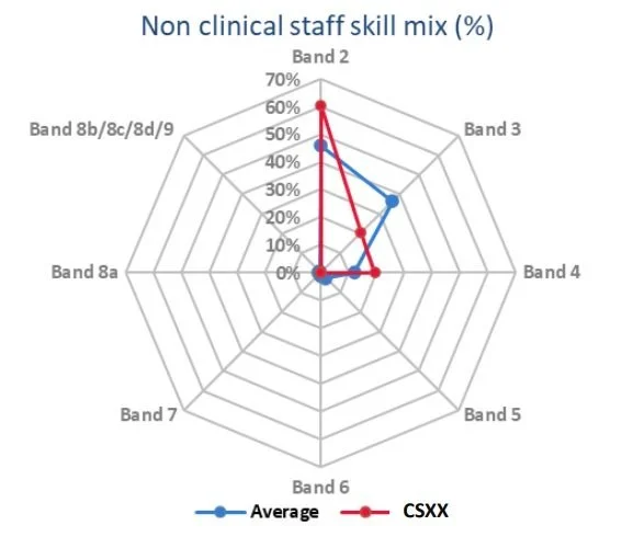
Radar charts are one the ways we show compositional analysis, i.e. comparing how one service or organisation’s activity, staffing, or other aspects break down over a set of headings compare to other organisations.
The blue line shows the composition for the whole set of organisations being compared, and the red line shows the selected submission.
In the example shown the radar chart shows that the group composition for non-clinical staff skill mix is made up of mainly band 2 and 4 staff. The selected submission has much lower use of Band 3 staff (only 20%) with 60% of the non-clinical staff workforce reported as band 2 staff and 20% for both Bands 3 and 4.
Compositional bar chart
We also use bar charts to for compositional analysis.
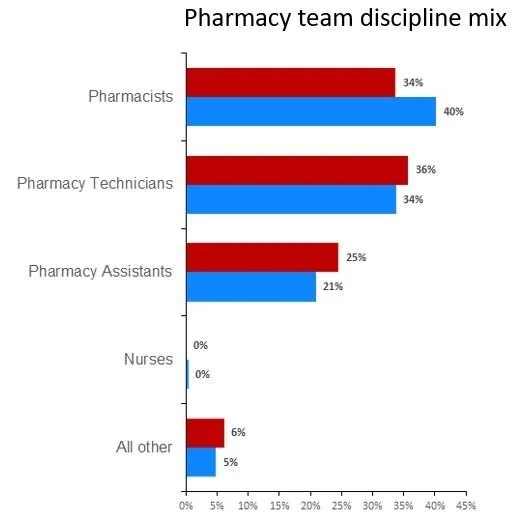
The blue bars shows the composition for the whole set of organisations being compared, and the red bars show the composition for the selected submission.
In the example shown we are looking at the discipline mix for pharmacy departments. The composition for the group as a whole is 40% pharmacists, 34% pharmacy technicians, 21% pharmacy assistants, less than 1% nurses, and all other at 5%. The selected organisation’s composition has fewer pharmacists and more pharmacy technicians and assistants.
Combined bar chart
In some cases we will want to look at several related metrics in a single chart. In such cases we will display the selected organisation’s value for the metric alongside the group average.
This enables us to identify patterns in the data and view the information from a group of related metrics together.
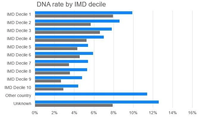
In the example shown we are looking at DNA rates for patients from different levels of deprivation. The organisation’s value shows in grey, and the group average in blue. Each heading is a standalone metric. I.e. Looking at the top two bars, for patients from the most deprived decile, an average DNA rate of 10% was observed for the group as a whole, and almost 8% for the selected organisation. By looking at all these metrics together a clear pattern can be seen linking higher levels of deprivation to higher DNA rates.
Timeseries chart
We use line charts to show timeseries data, examining how metrics change over time.
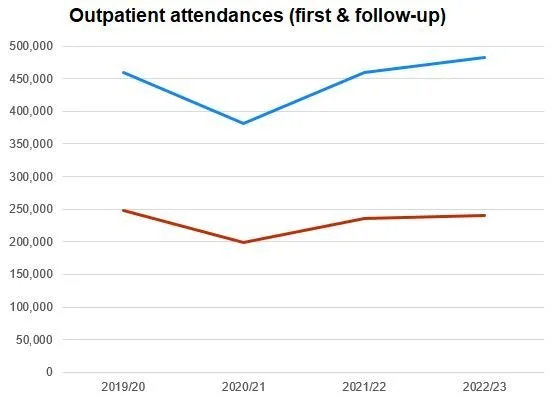
As with many previous examples we use blue to show the group average position, and the selected organisation’s value is shown in red.
The time periods are shown on the x-axis and the y-axis relates the metrics value.
In the example shown we display the number of outpatient attendances and how it has changed over a four-year period. In both cases we can see a dip in 2020/21, but while group average has recovered to a higher value than pre-pandemic, the selected organisation has not returned to the 2019/20 position.
